PRO-TEST
- Client
- PRO-TEST
- Service
- Brand identity
- Year
- 2026
- Team
- Artsem Pakanechny — art direction, design
- Scope
- Symbol, logo, color, typography, dot graphics, photo style, stationery, uniform, infographics, merch
PRO-TEST is an engineering company that develops and supplies measuring equipment and software for professional testing. It works with aviation, aerospace and industrial enterprises — where the cost of a measurement error is especially high.
The task of the identity was to show the company the way it works: precise, restrained, nothing extra. The principle «necessary and sufficient» became the basis of the whole system.
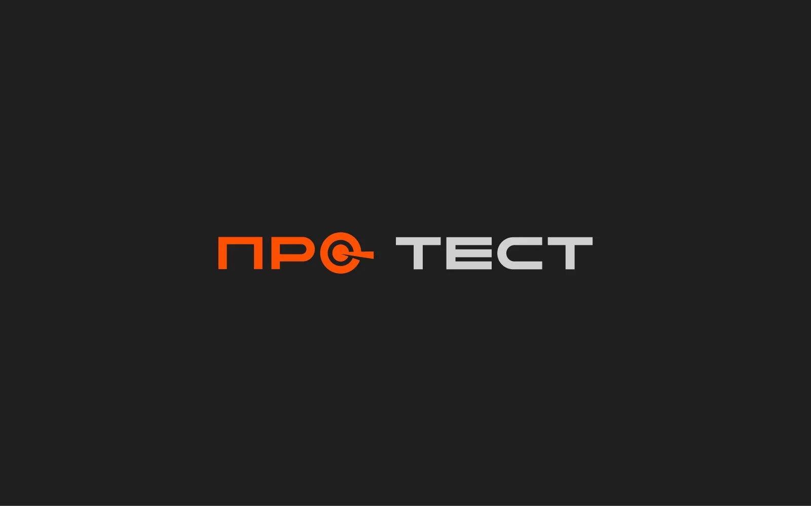
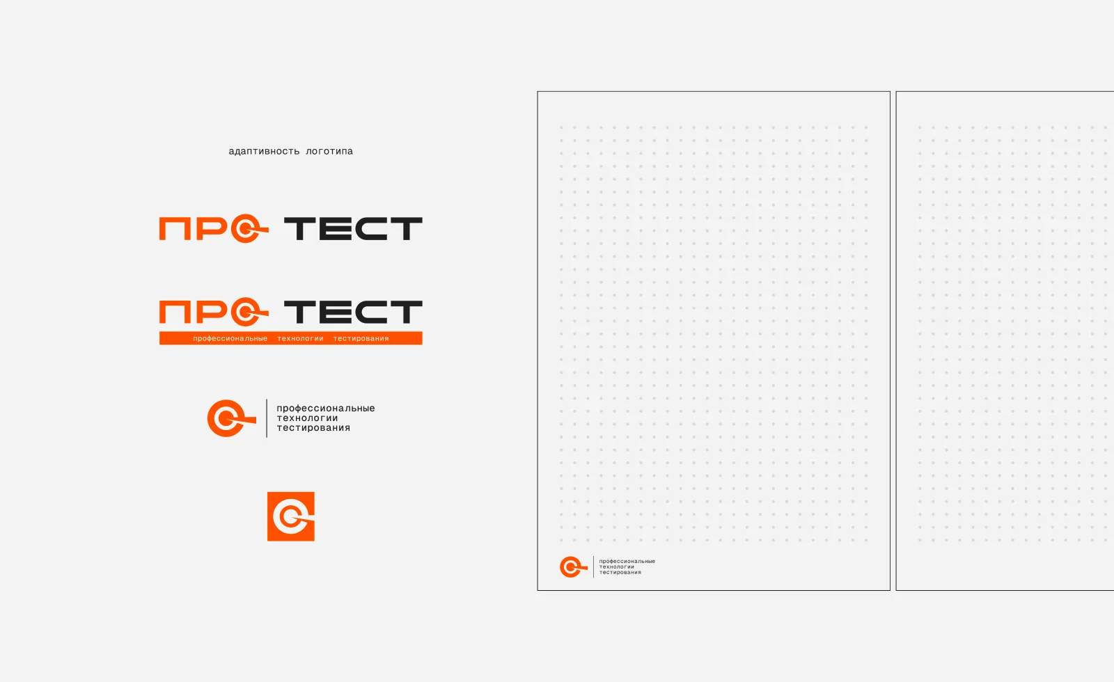
The symbol is based on the letter O — the central element of the logo. A circle with an inner ring and an indicator arrow refers to measuring instruments, sighting systems and accuracy — the key ideas of the company's work.
It works as part of the logo and on its own: on icons, avatars, stand graphics and equipment, where the full logo doesn't fit.
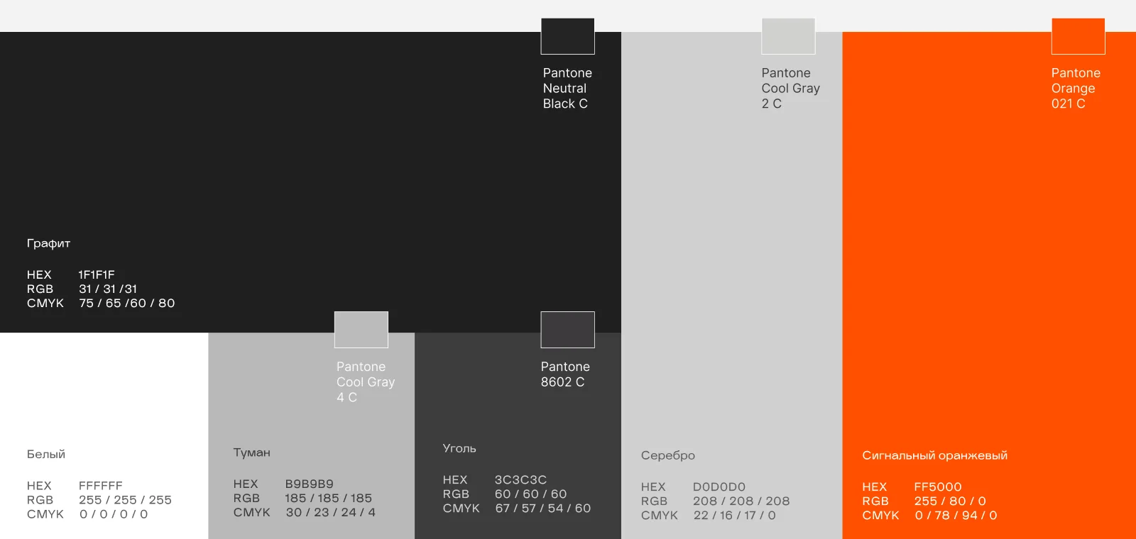
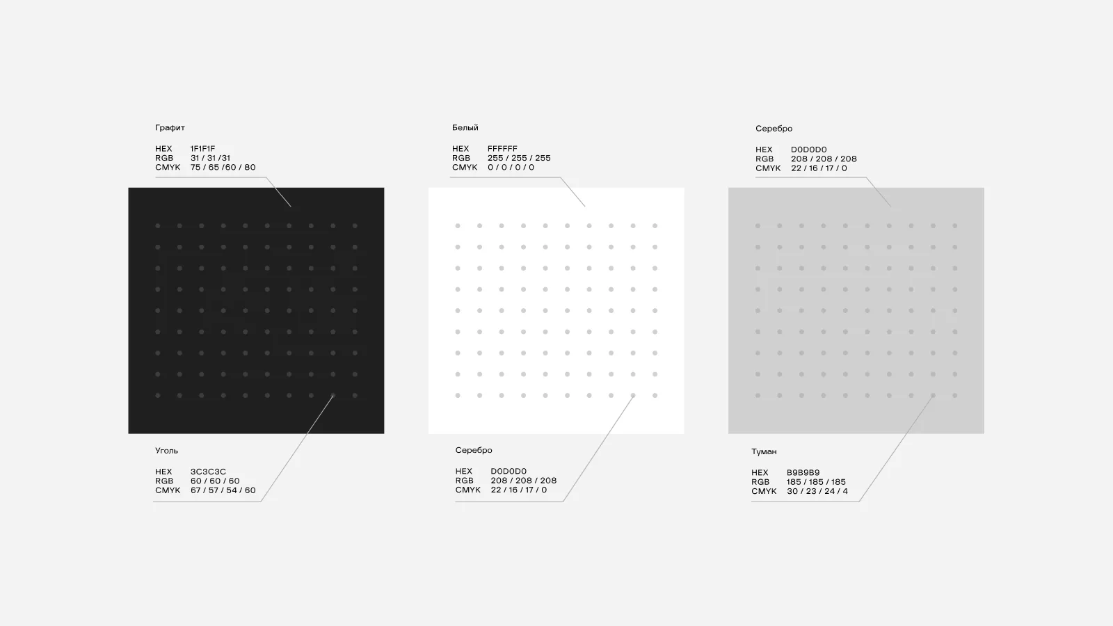
The color system is built on three backgrounds with a clear logic. White and grey are equal for print: white where there is a lot of text and data — documents, letters, proposals; grey for shorter formats — business cards, signage, info materials.
Black is for representative formats: envelopes, folders, presentations. On every background the dot pattern is matched in tone, so it supports the surface without competing with the content.
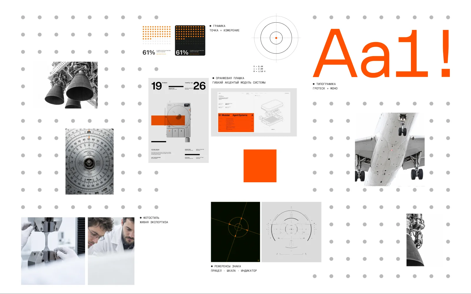
Typography reflects the brand's position as precise and professional; the pair of typefaces separates business and technical levels of communication.
TT Hoves Pro is used for headlines and main communication — strict geometry and a neutral character. Geist Mono carries technical information: article numbers, parameters, protocols.
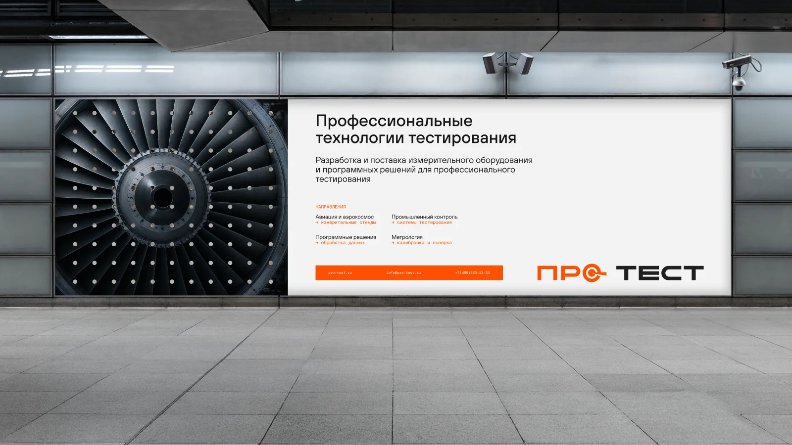
Every dot is a probe: one measurement, one attempt, one result. Many dots are many tests that lead to an accurate result — the pattern visualises the very essence of testing.
In the identity the pattern works as a background layer: it holds the structure on light and dark surfaces, adds depth to photos and ties all carriers into one system.
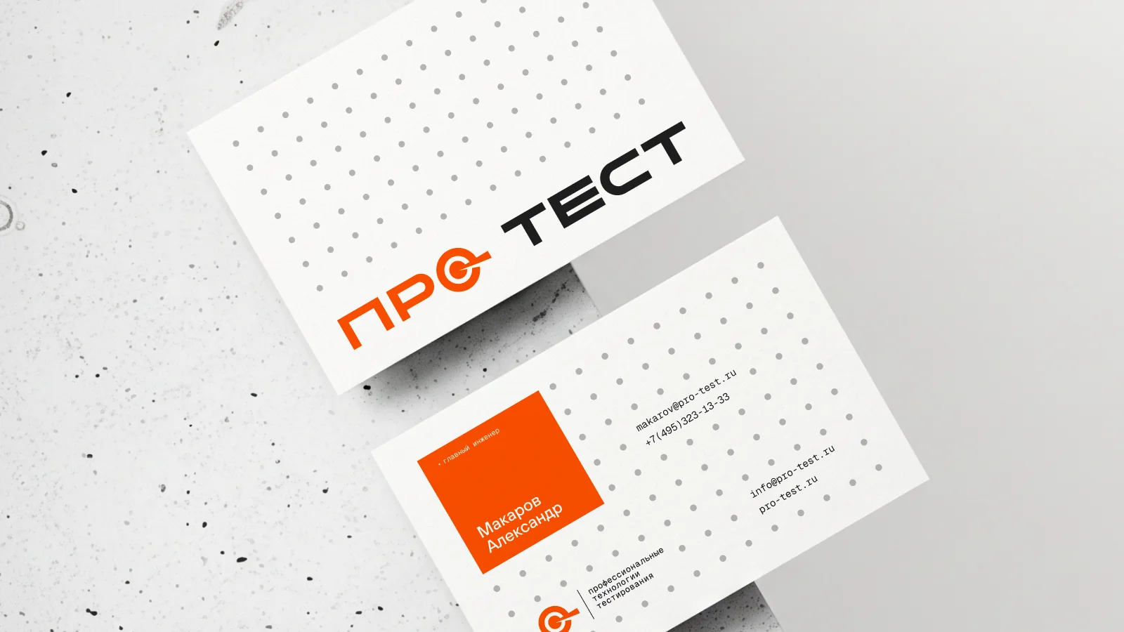
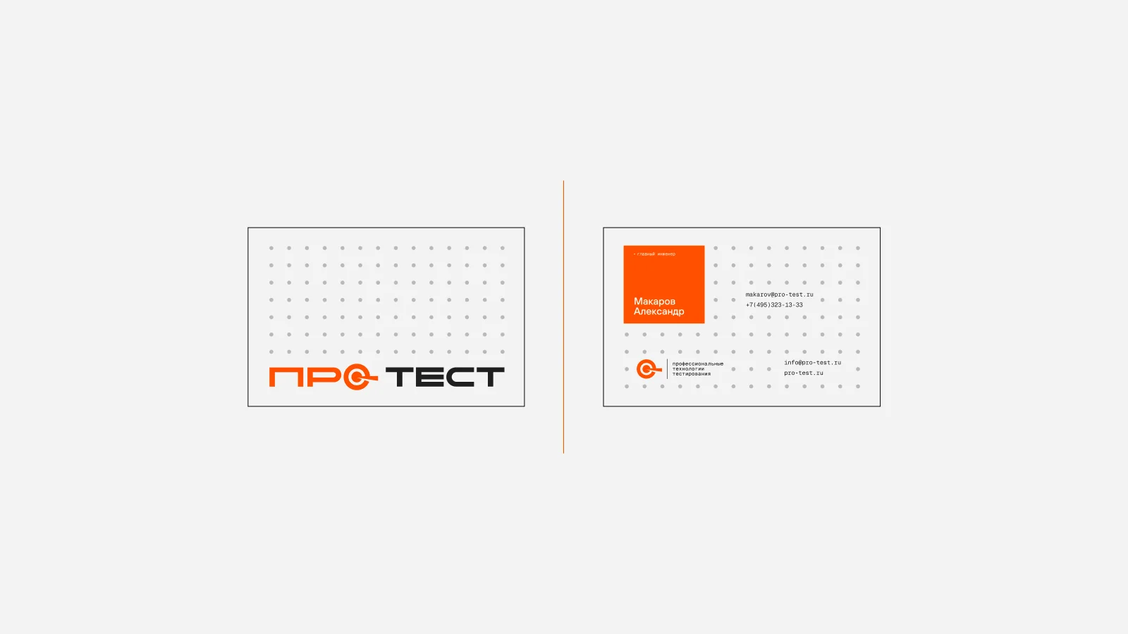
The orange plate is a flexible module, not a fixed shape: it adapts to the content inside — contacts, a name, a short statement. The form always follows the content.
At the same time it works as a marking — an accent tag that highlights the important. Its proportions are flexible, its function is constant.
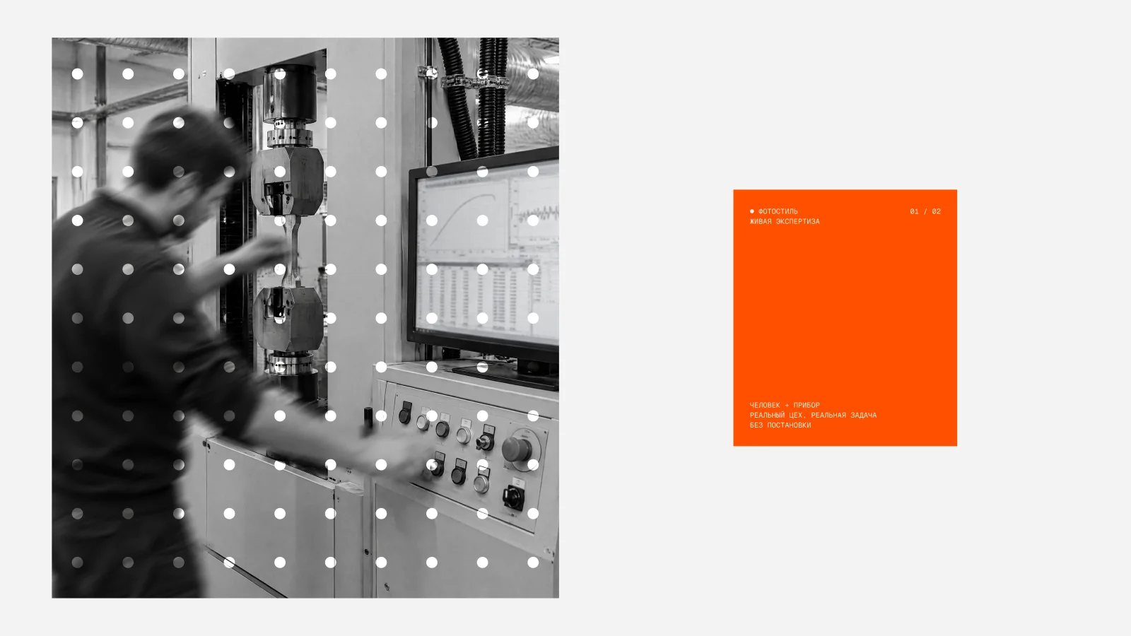
For an engineering B2B brand that works with precise measurements, photos must read as authentic, not staged — a shot as a document of the process, not an advertising picture.
The formula of the photo style: engineering precision and live expertise.

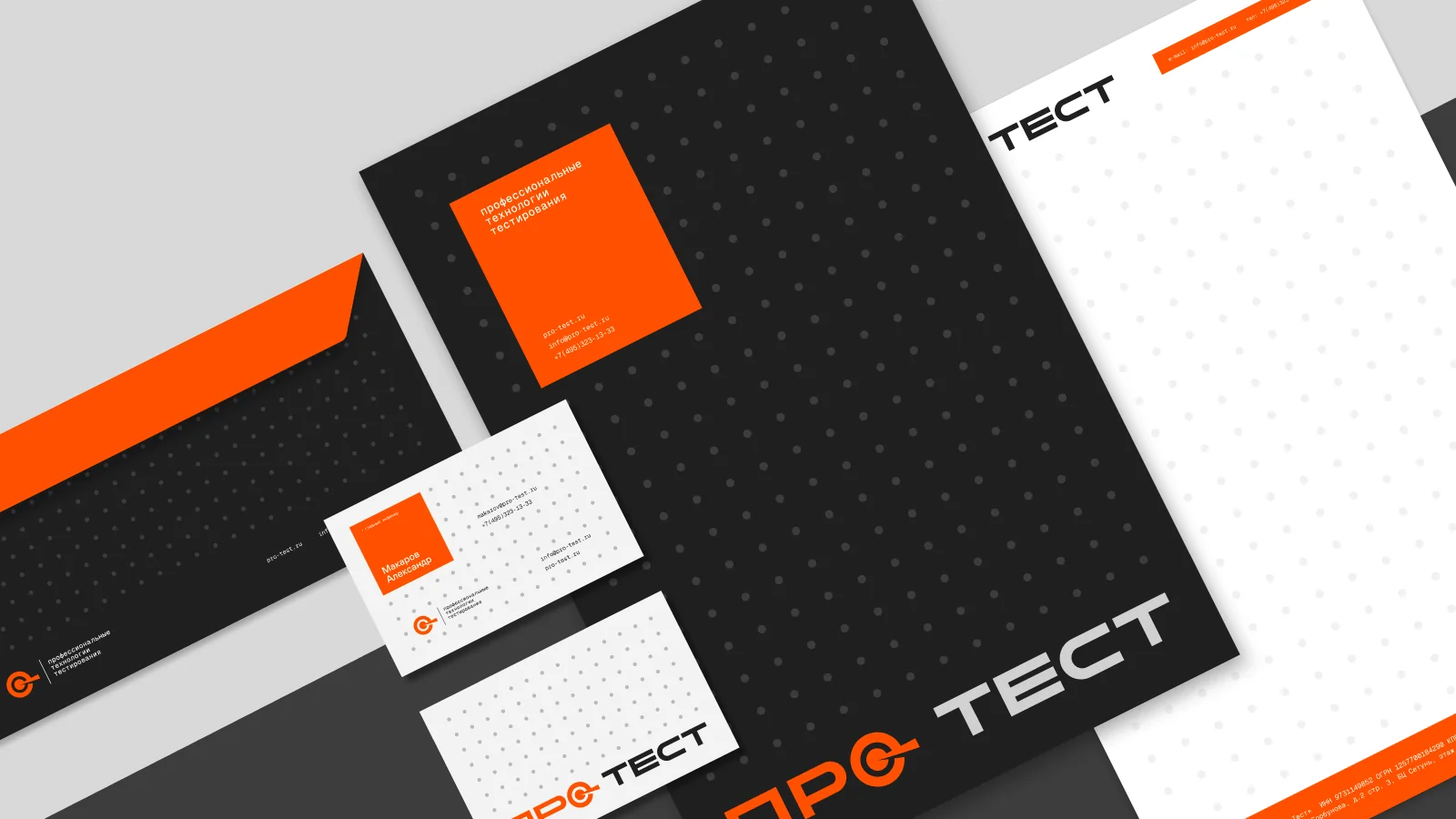
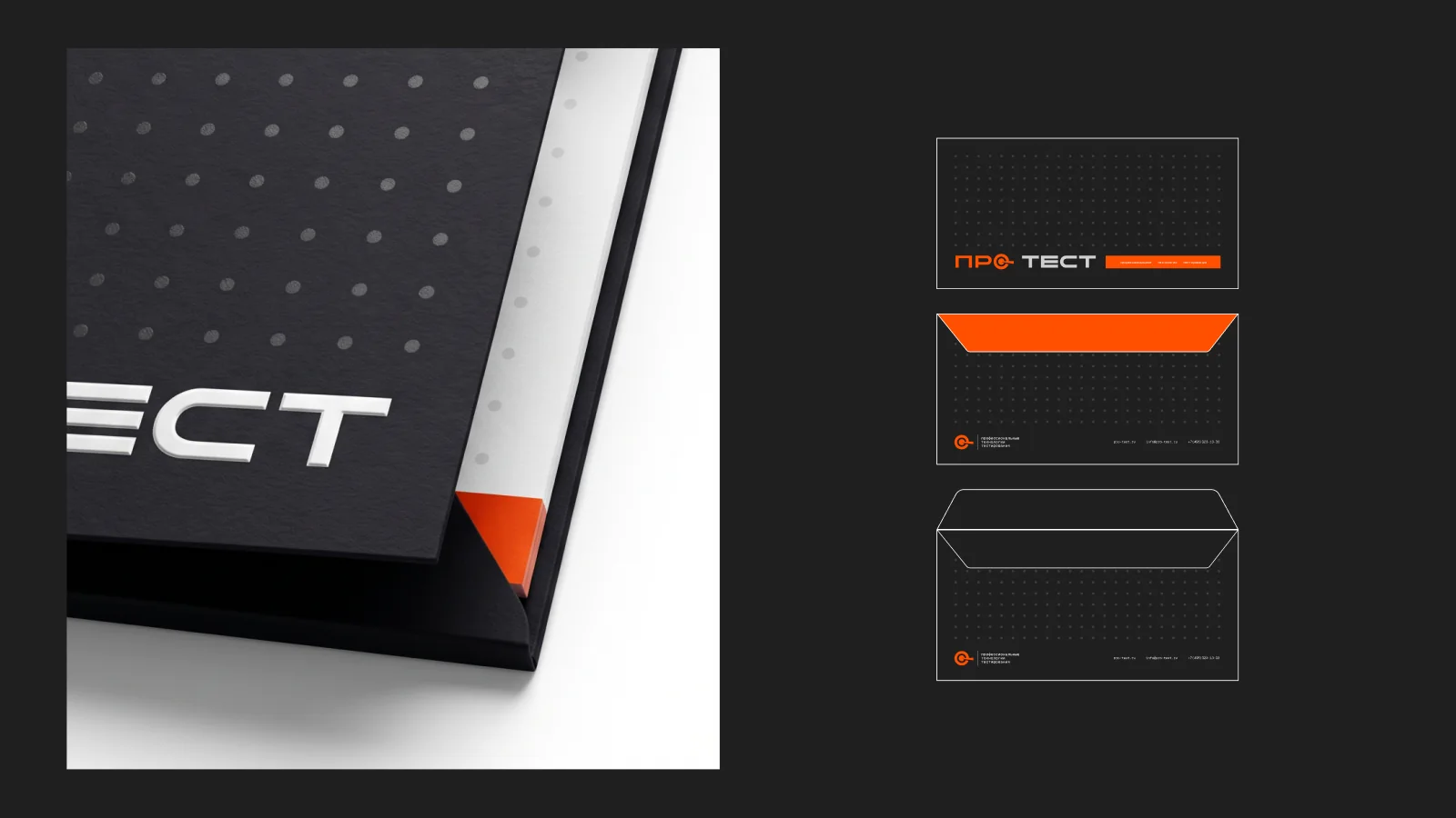
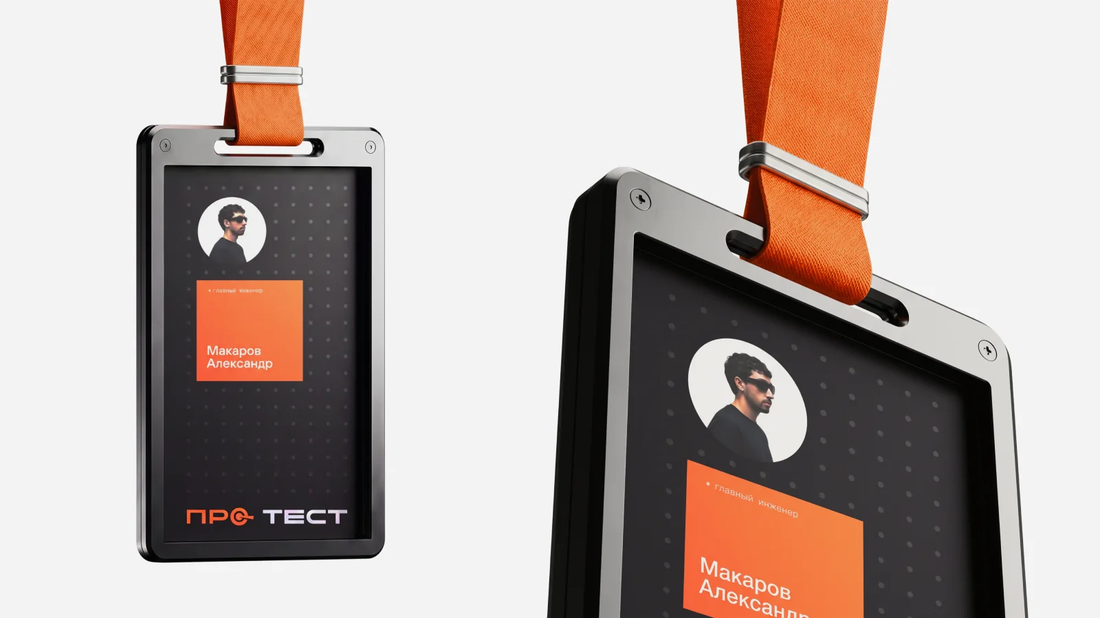
Carriers are where the identity meets clients and staff every day: in letters, at negotiations, at exhibitions, in the workshop. The system covers business documents, everyday items like notebooks and pens, and staff — uniform and badges.
All of them are built from the same elements: the symbol, the dot grid, the orange plate and three backgrounds. So any item, from a business card to a work jacket, reads as part of one system.
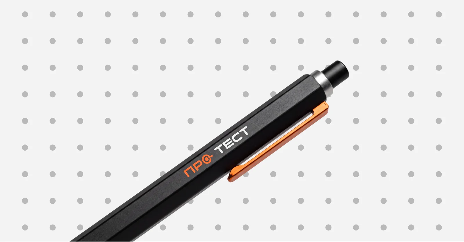
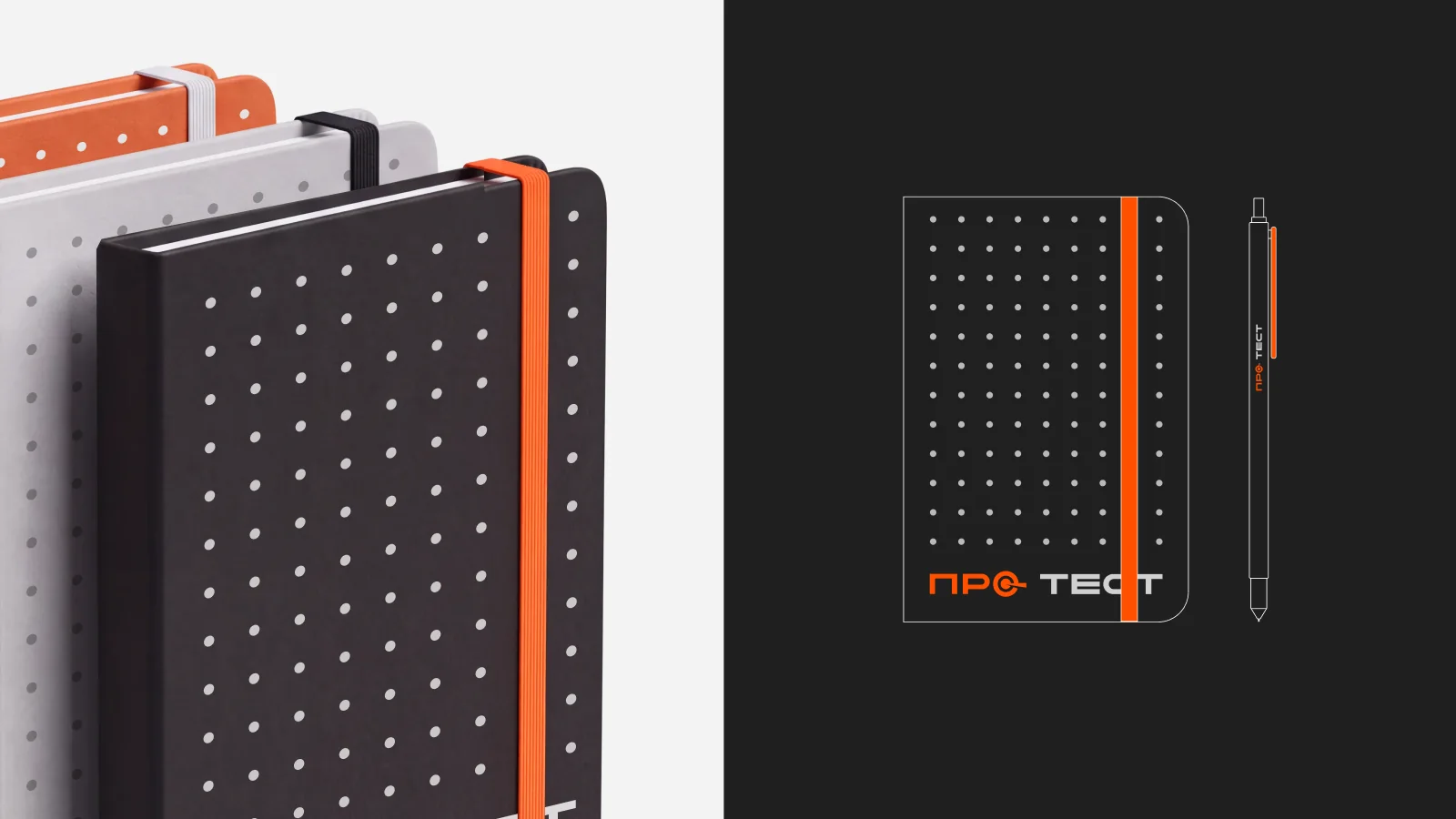
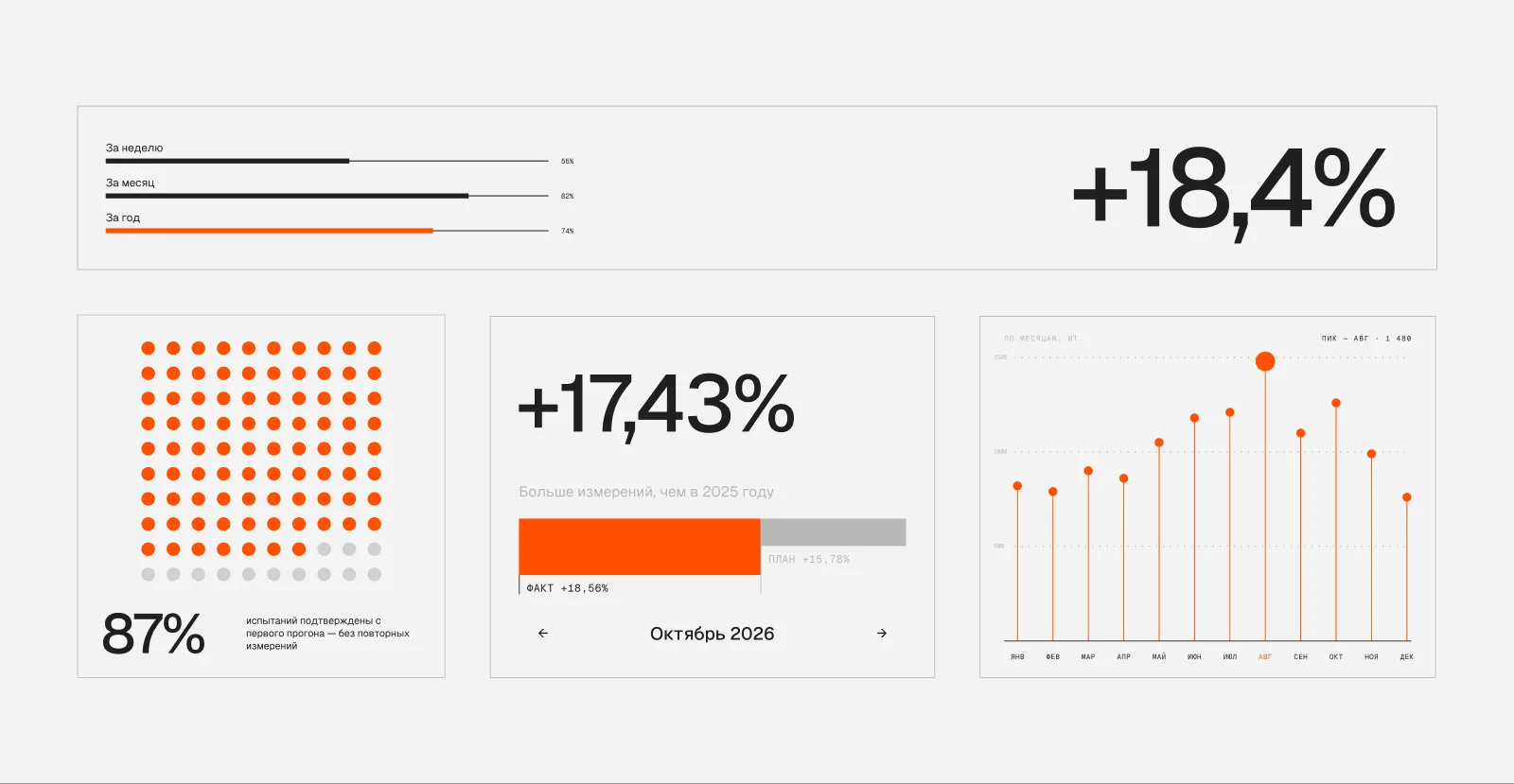
An engineering company speaks the language of data, so infographics became a full part of the identity — in presentations, reports, proposals and exhibition stands. It is built from the same elements: the dot grid, the orange plate, graphite and white.
The rules are simple: one orange accent per chart for the main value, the rest in greys; numbers and captions in Geist Mono, like on scales and technical plates.
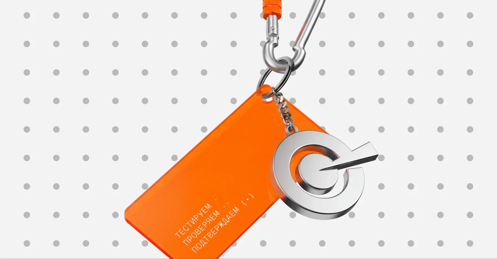
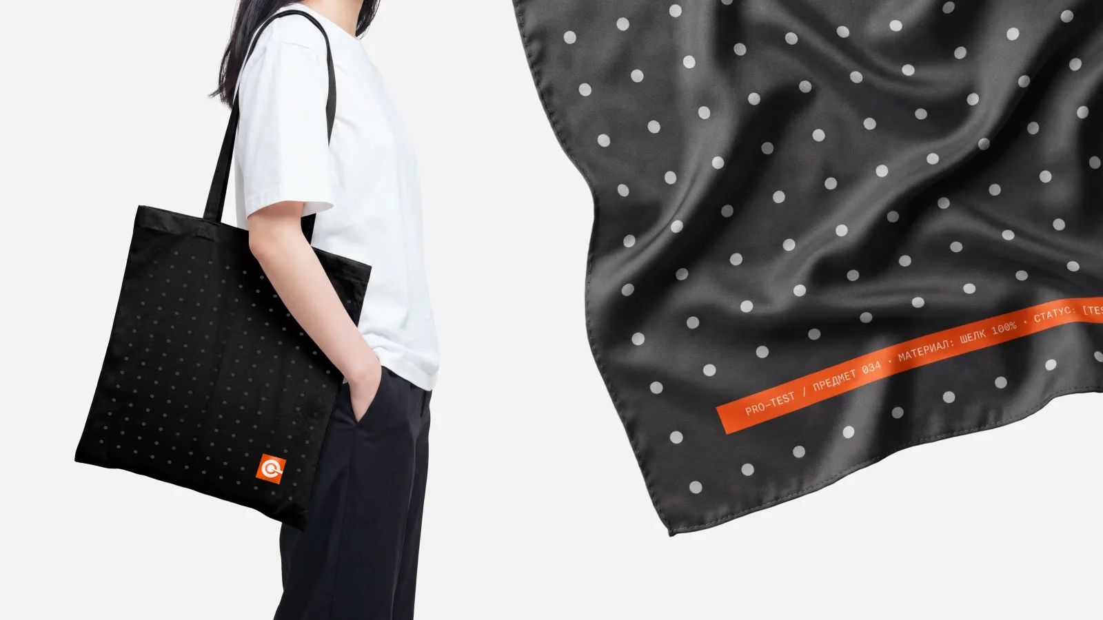
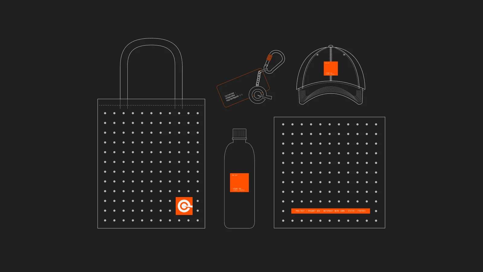
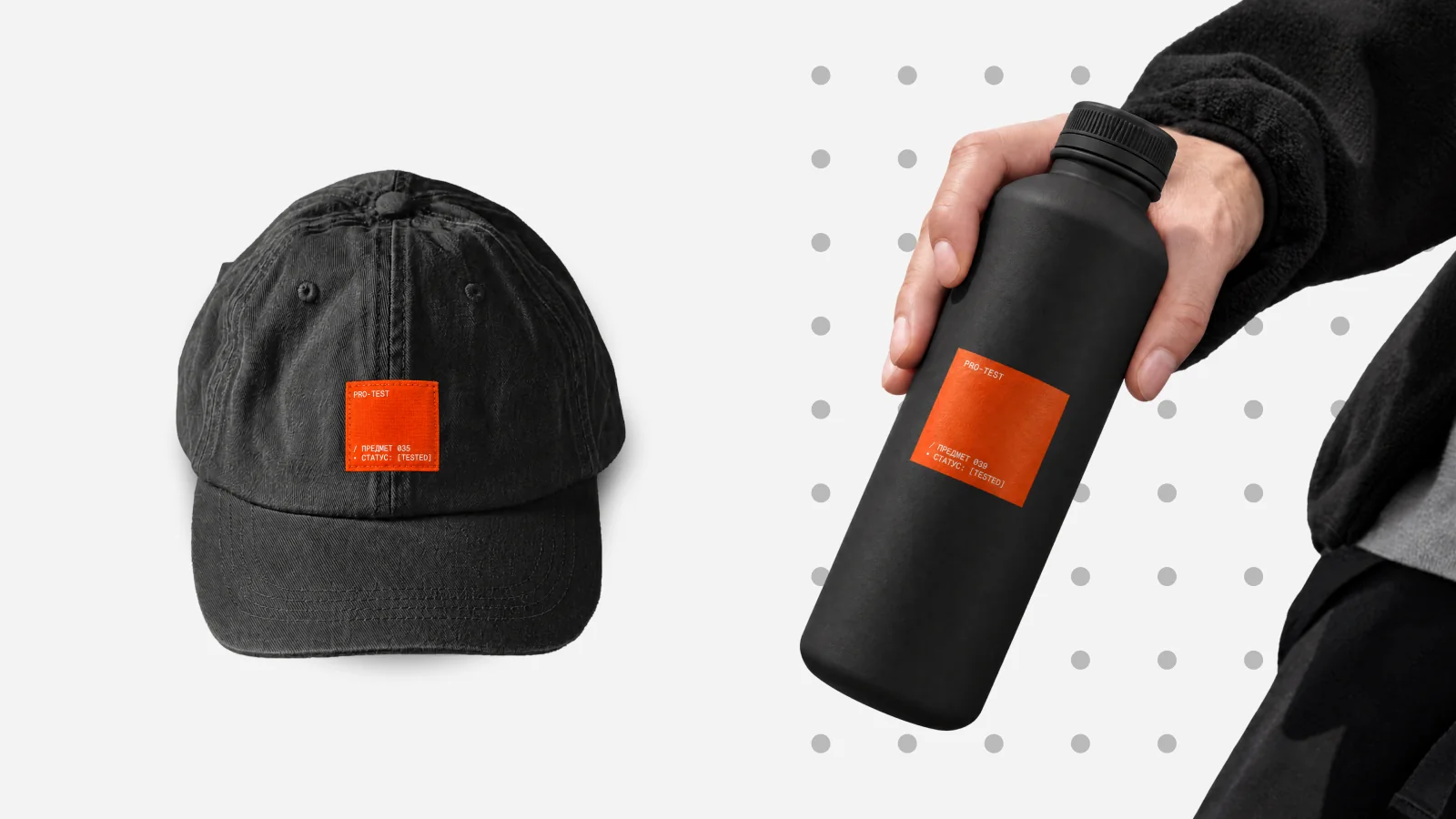
Merch moves the brand from documents into the everyday life of the team and partners. The same rules apply: graphite and white as the base, orange as a point accent, the symbol instead of the full logo where space is tight.
The character comes from engineering aesthetics: markings like technical plates, a monospaced typeface and the slogan «Test · check · confirm». The collection includes a cap, keychains and a silk scarf.
The task was to turn a symbol created a year earlier into a whole system that works as precisely as the company's equipment. PRO-TEST got a recognisable target symbol, an adaptive logo, a strict palette with a fixed orange accent, typography and a graphic language of dots.
The system covers all key touchpoints — documents, everyday carriers, uniform and merch, photo style and digital. The brand now looks the way the company works: precise, restrained, nothing extra.
Want to discuss a project?
Message us on Telegram or by email — or fill in a short form, we reply within one working day.