BEARLOGA
- Client
- Bearloga
- Service
- Brand identity concept
- Year
- 2025
- Team
- Artsem Pakanechny — art direction, design
- Scope
- Logo, bear mark, palette, typography, illustrations, icons, packaging, merch
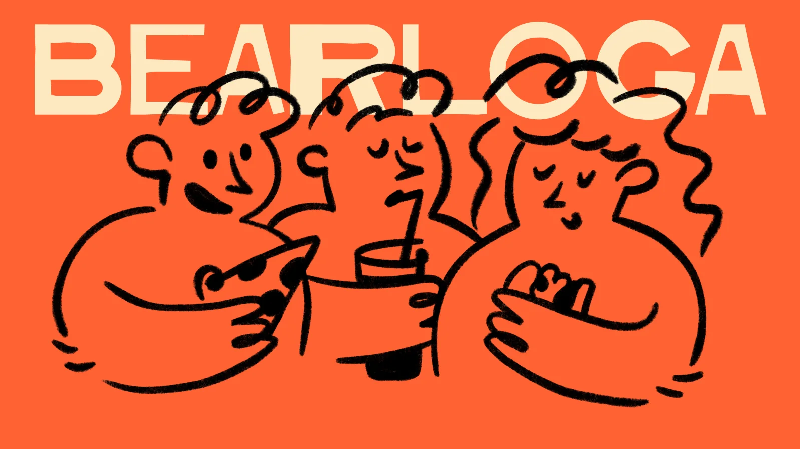
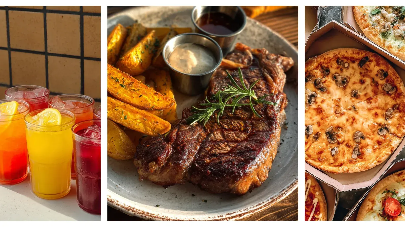
Bearloga is a burger bar where it is warm even when the wind is blowing outside: big paws, hot food and happy guests. The name plays on «berloga» — a bear's den — a cosy place you return to.
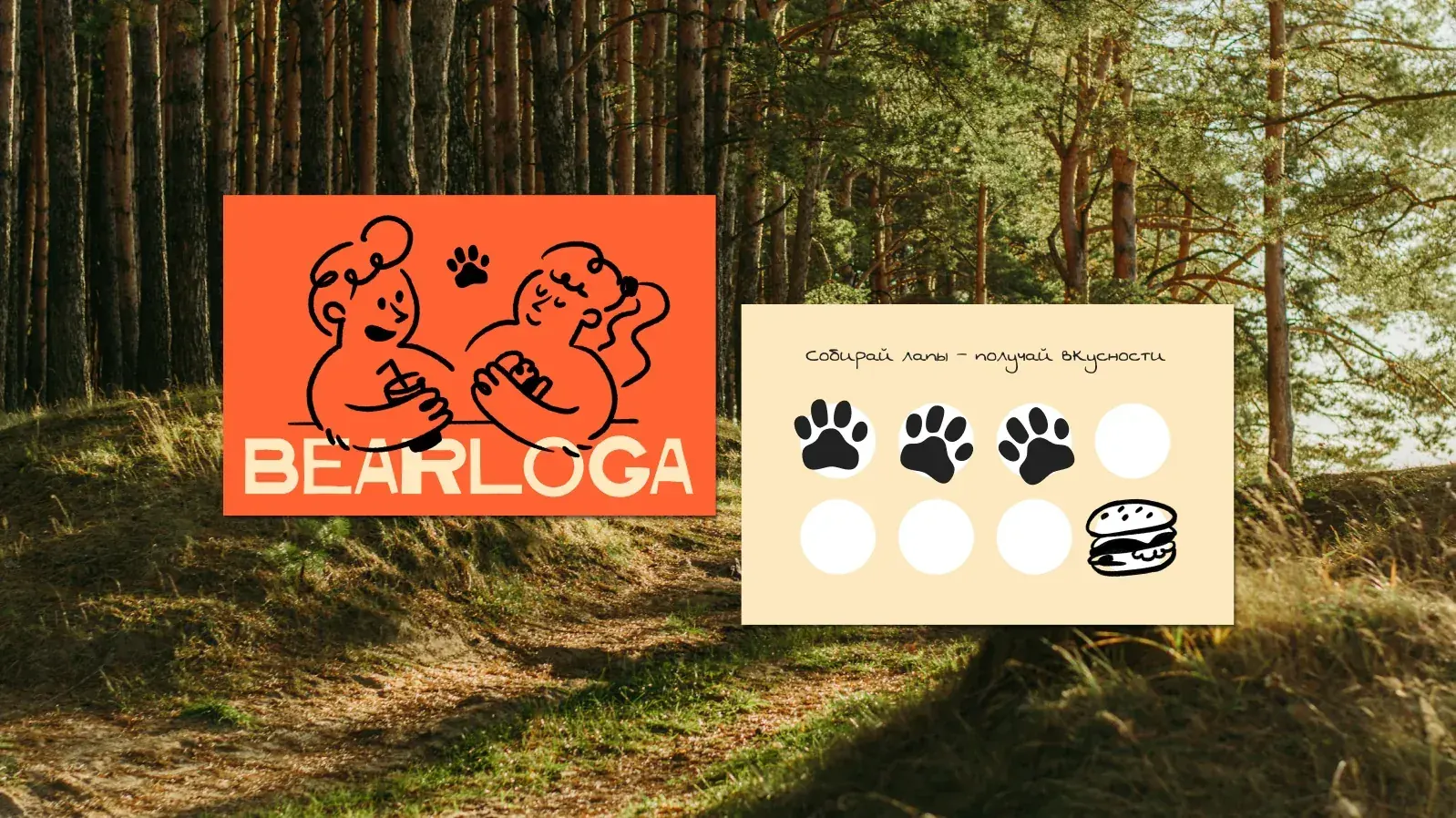
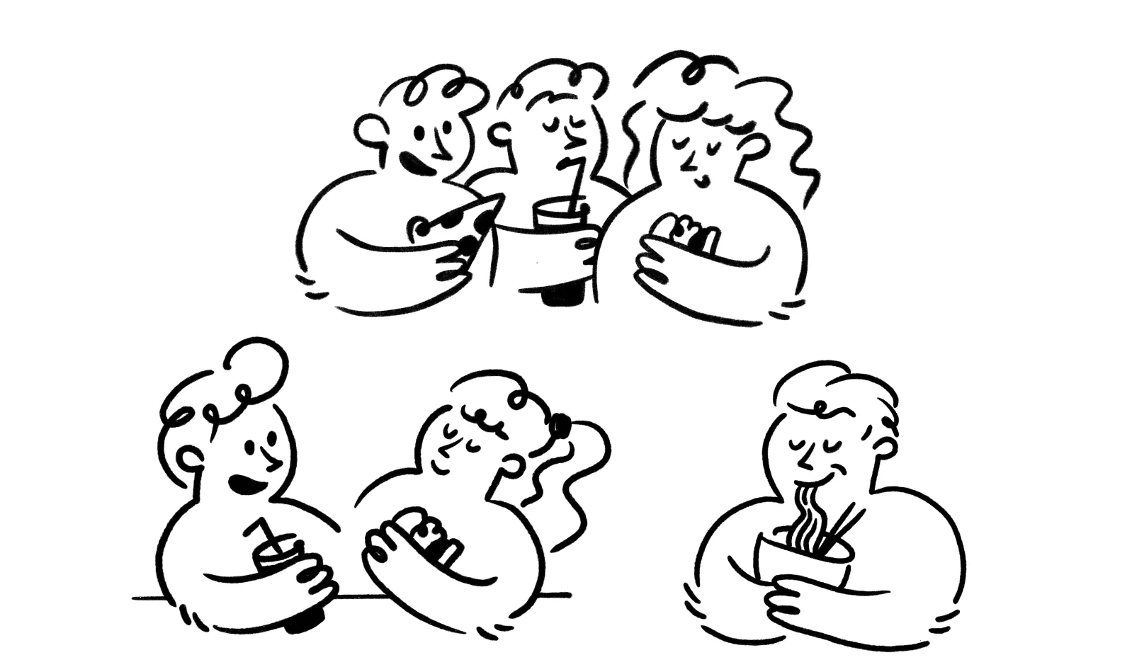
The identity concept is built around this feeling: loud, tasty and bear-like, with hand-drawn characters who eat, drink and enjoy the moment together.
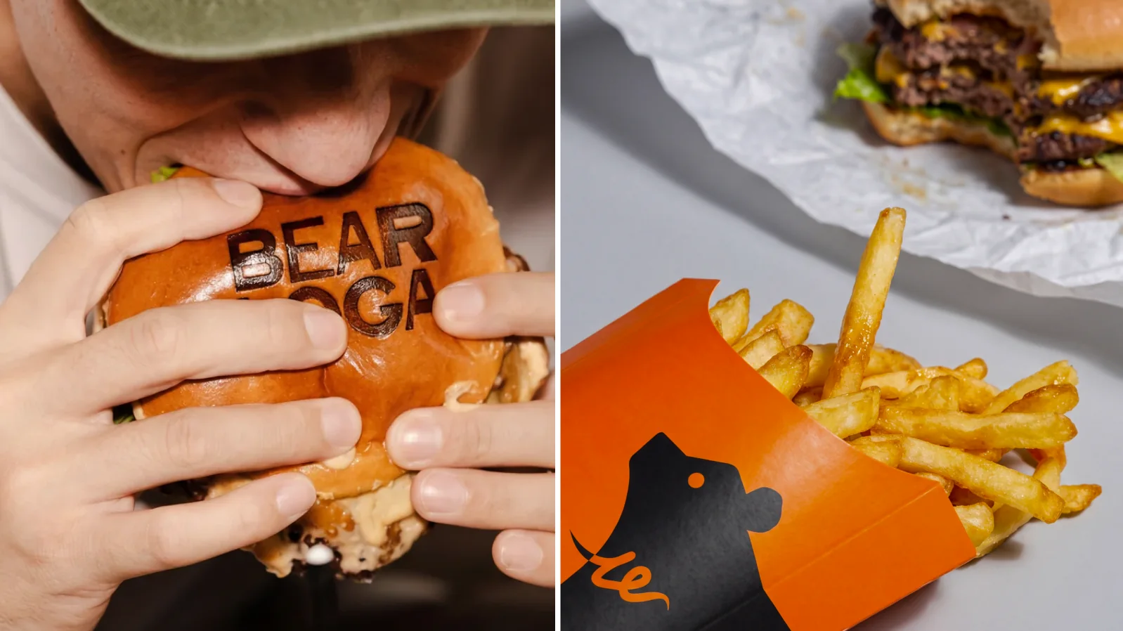
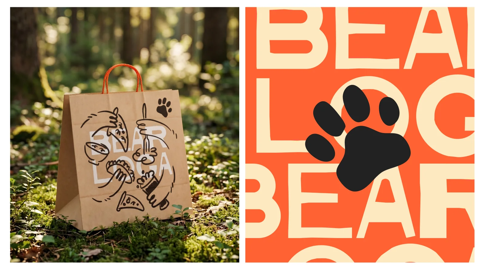
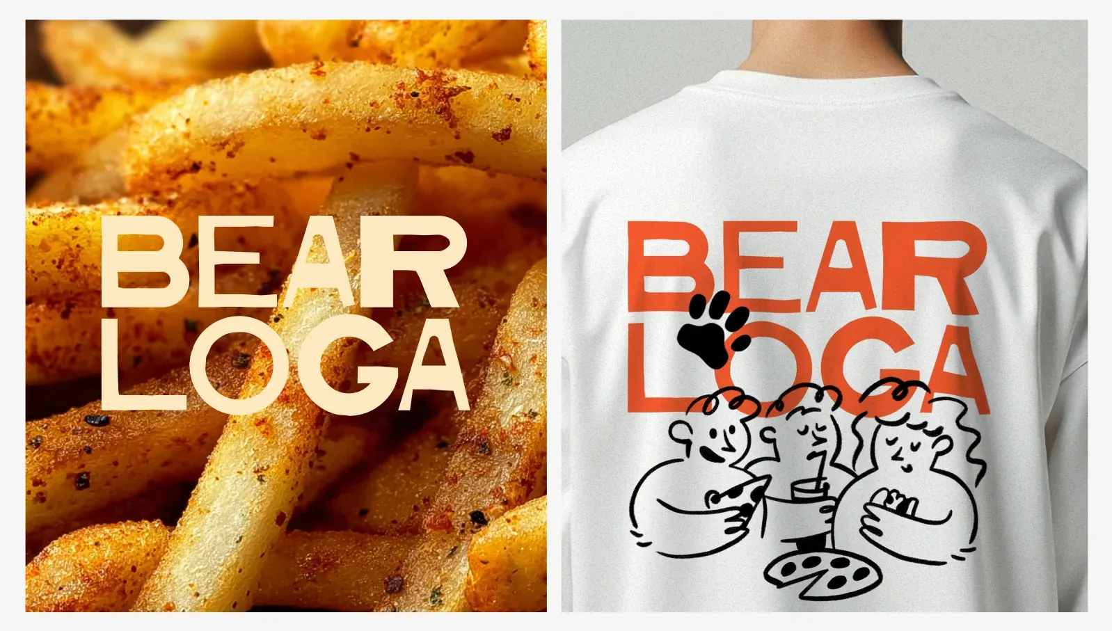
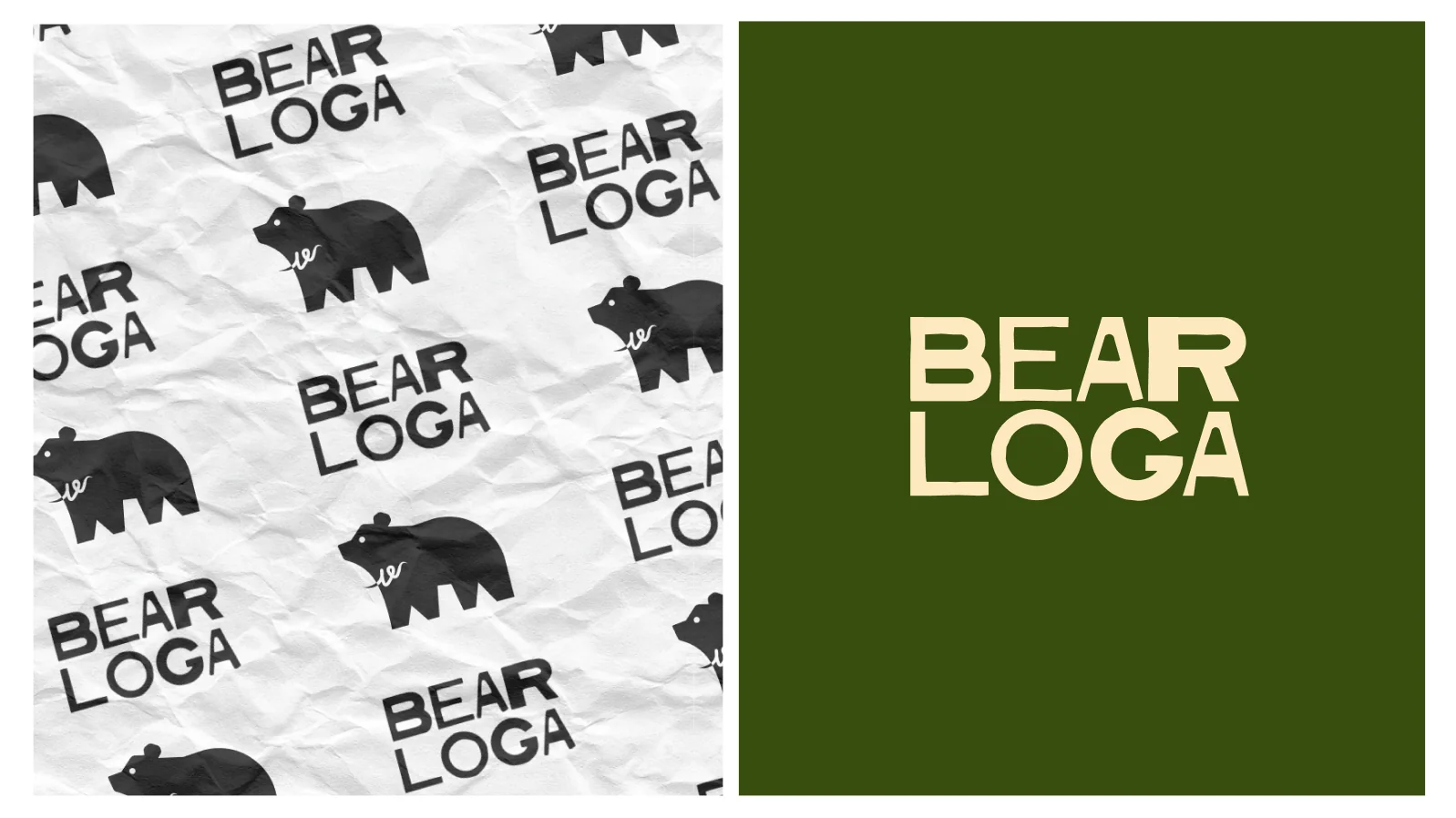
The wordmark is built from cut, slightly uneven letters — like stamped on a burger bun or cut out of paper. It reads well both in one line and in a stacked BEAR / LOGA block.
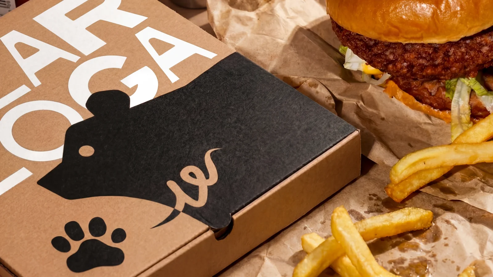
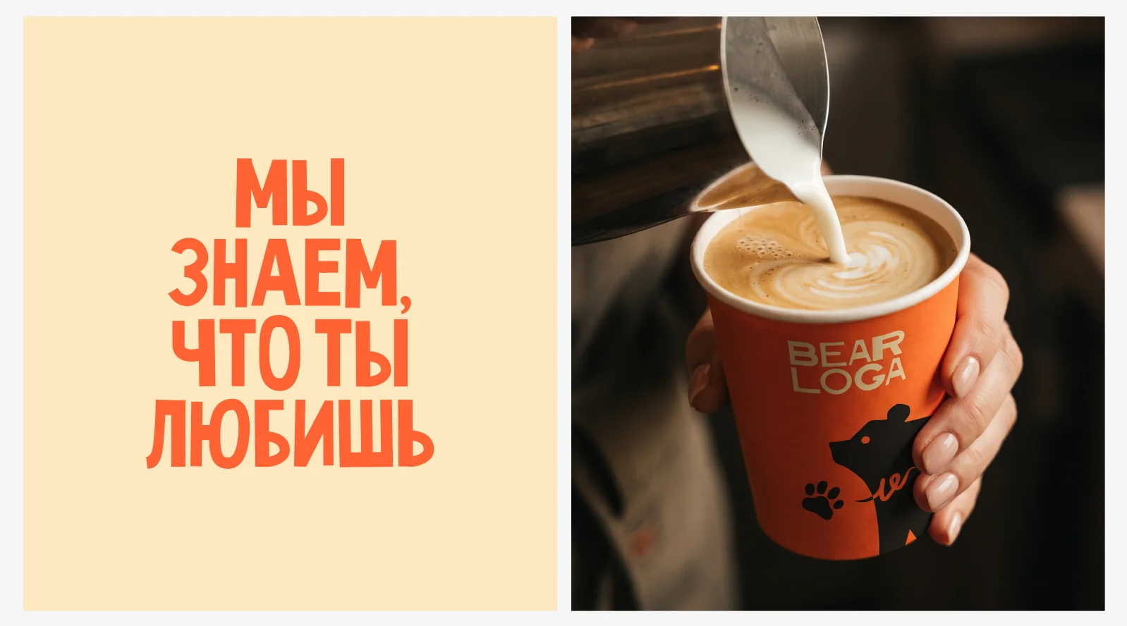
The bear silhouette with a handwritten «e» is a secondary mark for packaging, cups and stickers.
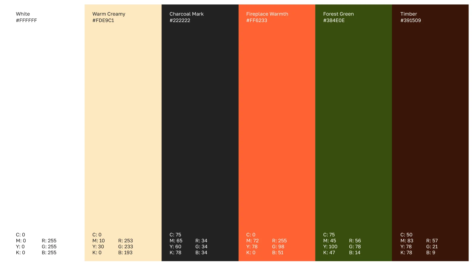
The palette smells of a campfire in the forest. Fireplace Warmth orange #FF6233 and Warm Creamy #FDE9C1 are the main pair, Charcoal Mark is used for drawings and type.
Forest Green and Timber brown bring in the forest and wood, and give the brand a deeper, evening mood.
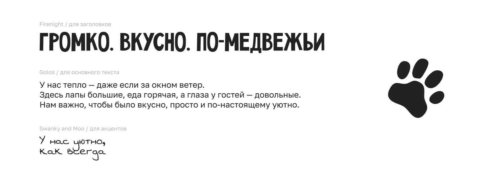
Firenight is the loud headline face: «Loud. Tasty. Bear-like». Golos carries the main text and menus — calm and easy to read.
Swanky and Moo is a handwritten accent for short warm notes like «It's cosy here, as always».
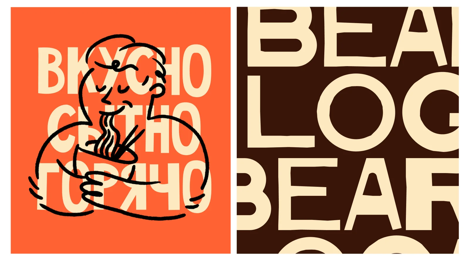
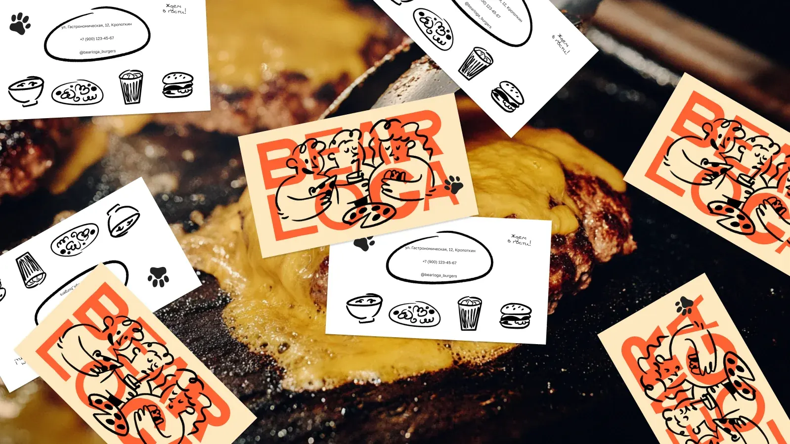
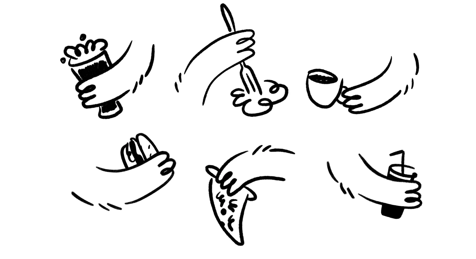
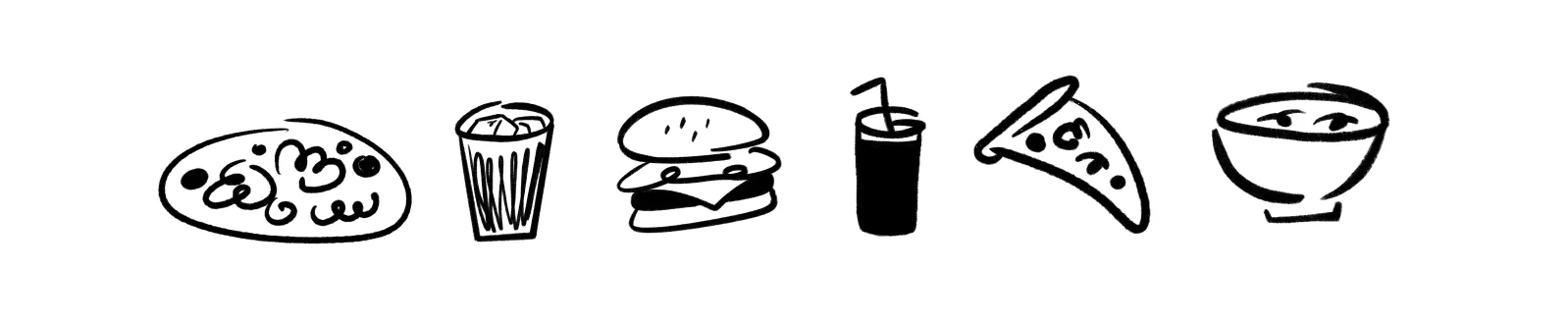
The heart of the brand is a series of hand-drawn characters: round, kind and always eating. Separate hands with food and drinks and a set of simple food icons extend the system.
The lines are drawn with a dry brush, so the graphics feel alive and homely — like a sketch on a napkin.
Packaging, cups, bags and boxes carry the stacked logo, the bear and the characters. A loyalty card «Collect paws — get treats» turns every visit into a small game.
Slogans like «We know what you love» speak to guests in a friendly voice.